
Communicating about Open Access
Communication around open access can be complicated - both for authors during the publishing process, and readers while accessing articles.
When you want to print something, you know to look for a printer icon without even thinking about it. But when you want to know which access type an article is, what are you looking for? We discussed this back in November and now you can read about it in this blog!
 February 18, 2023
 Copenhagen, Denmark
Back in November 2022, Lisa Janicke Hinchcliffe and Kalyn Nowlan of the University of Illinois Urbana-Champaign published the article: “A Failure to Communicate: Indicators of Open Access in the User Interface” on The Scholarly Kitchen. It really caught our eye at ChronosHub because communicating open access is a big part of what we are trying to streamline on our own platform!
Our host Romy Beard invited Lisa and Kalyn to join a panel with our own UX Designer Yen M.T. Trinh. Together they spoke about how open access is communicated to readers and how it could be changed for the better. The webinar started by thinking about the reader’s experience of open access and their journey: how does a reader know what is closed and open access? How do the major publishers display this? And, most importantly, why should we care about this?
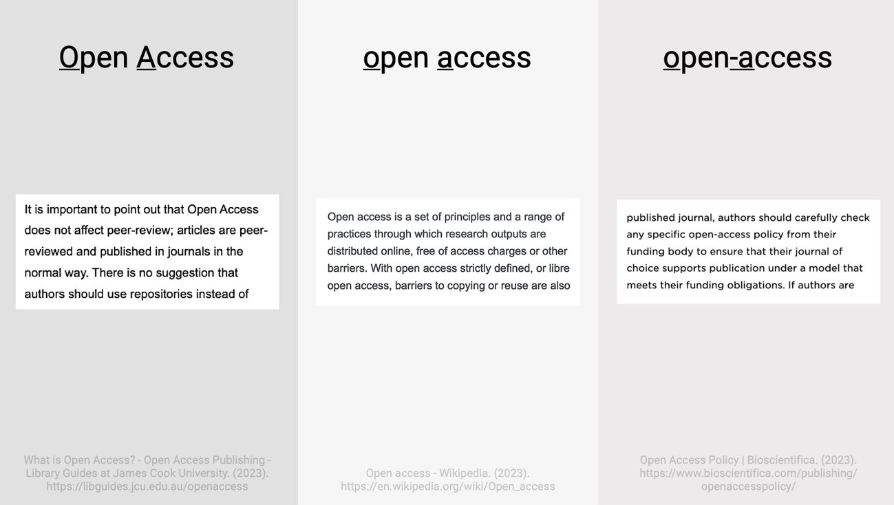
When you want to print something, you know to look for a printer icon without even thinking about it. But when you want to know which access type an article is, what are you looking for?
It’s something we don’t like doing at ChronosHub, but let’s overload you with options. Imagine you’re in full flow with your research, and you’ve got lots of tabs open with articles. Next to the articles there are icons and text trying to tell you something about it: green dots, open and closed locks, green ticks, yellow ticks, free access, full text, open access, licenses, available access – what does it all mean?
This is what prompted Kalyn and Lisa’s research. They observed that publishers use standardized text or symbols to indicate whether articles in hybrid journals are open access. However, despite publisher efforts to standardize their own open access indicators, they noticed that there was still user confusion about what the identifiers and terms mean.
Hybrid journals are interesting in this case because they have open access and subscription content. Therefore, having open access indicated on an article is important because it communicates to a reader that they can read it for free or reuse some of the information. Surely if open access is indicated on an article, it should be easy to differentiate?
If only it was that straightforward! To start their research project Kalyn and Lisa posed two key questions: how do publishing platforms indicate which articles are open access? And is there consistency in the indicators used within and across scholarly publisher platforms? They picked five major publishers to assess this: Elsevier, Springer Nature, Wiley, Sage, and Taylor and Francis. These publishers were selected because it is likely that faculty members or students would interact with these platforms during their own research journeys.
To gather data, they looked at the table of contents in journals to see how open access is indicated there. A keyword search was also conducted on the publishers’ platforms using the term ‘pandas’. From this they started to gather information about the open access indicators used, alongside how free and subscription access is displayed.
This is where things start to get interesting. Publishers themselves are consistent in using their own indicators, but the open access indicators vary greatly across the different publishing platforms. So, if you are reading open access articles about pandas on Taylor and Francis, you will likely recognize the open access indicator across their platform. However, if you switch over to reading about pandas on Elsevier the way they indicate open access articles is different. It sounds like we are starting to understand why readers are so confused!

Let’s take some time out here and think about why communicating open access matters. An audience member asked the panel this question. Lisa completely understood where they were coming from because if a reader finds something they can access, they will simply start reading, get what they need, and not give the access type a second thought.
The real issue is that the initial user, the reader, might not know they can access some articles without a paywall. Not everyone looks at an icon of a lock next to an article and thinks ‘I can get to this’ even in cases where a lock icon is showing as unlocked. For publishers, communicating the access type could influence the article’s reach which impacts on the authors. Additionally, librarians rely on the indicators to support those who are using the publishing platforms.
Other problems can arise if you are in a cross institutional collaboration. You might send a link to an article you think your partners can access, but it turns out they cannot. Not knowing how to discern what information you have access to could prolong the research process unnecessarily.

It’s not just the visual identifiers that cause confusion. It's fair to say that outside of librarianship and publishing, terms like “open access,” “full text access,” “available access” and “free access” are unfamiliar. However, Kalyn and Lisa spent some time trying to decipher what the publishers really mean when they use these terms, because it is not consistent across platforms. Free access in most cases is bronze open access, which means the article is free to read, but it doesn’t have an identifiable license. That would mean as a researcher, there will be restrictions with what you can do with the content. This kind of stuff is good to know, right?
Our UX Designer Yen considered that perhaps the confusion stems from the fact that we don’t have a good enough conceptualization of what the term open access means, and what it does not mean. It is a term that is used loosely and at the same time it is quite specific. This might be why there is not a consistent identifier for different types of access.
From Yen’s perspective, users have not learned to look for an identifier if they are looking to understand a content type. Lisa noted that this has been done, but on the separate platforms. For example, SAGE conducted user research before rolling out their icons to make sure they would be widely understood. Again, we see that the problem is that the identifiers are not consistent across platforms. To add to the problem, an individual publisher cannot own the cross-platform experience.
At the end of the day we can’t expect end users to complain to the publisher, because they often don’t realize that they are getting it wrong and can easily bypass the article they would have access to! The solution needs to be proactive.
Yen took us through how to establish a consistent and coherent visual identity, to start a discussion about how open access can have its own visual identity. She pointed out that it must be consistent, but also flexible enough to be used in a variety of settings. At the moment the lack of consistency prevents the user from learning something, retaining it, and recognizing it again. Alongside consistency, Yen recommended that we also consider coherence, which is ‘the expression of similar things in complementary ways.’ So that would mean ensuring the open access indicators can be adapted to all content types.
There could also be another solution. In an article for Plan S, Sally Rumsey, OA Expert for Jisc, argued that open access should not be indicated. Sally looked at the research produced by Lisa and Kalyn. Interestingly, her conclusion was to move the focus away from open access: “We should be highlighting works that have barriers to access and use, rather than the other way round. My local council doesn’t bother telling me when a road is open, and I am able to drive down it. They only bother to erect a sign when it’s a dead end, a cul-de-sac, or no entry. Surely the world should by now have shifted to expecting OA without it having to be specifically labelled?”
Even if this is the case, better explanations of open access indicators or a shared taxonomy of indicators across the industry would decrease user confusion and improve the user experience. But which rules would we use to create these indicators? Who is going to be responsible? Is there a role for different organizations to get together and agree on something?
Lisa thanked Yen for clarifying the differences between consistency and coherence in the design process. She thought that this approach is something that an overseeing organization could implement. Thinking through the lens of coherence would provide a cross platform experience that is not available today.
There are already examples in the industry where publishers have agreed on standard iconography, such as the seamless access icon and the GetFTR (Get Full Text Research) data set. The next step is finding an industry body or a community initiative to take ownership. In response to Lisa and Kaylyn’s article, two organizations have been suggested to them. One is NISO and the other, unsurprisingly, is STM which is where GetFTR and seamless access are based.
We ended on a positive note - the future looks hopeful! The panel did think that coming to an agreement on this can be done, it is just a question as to whether the community sees it as a priority.