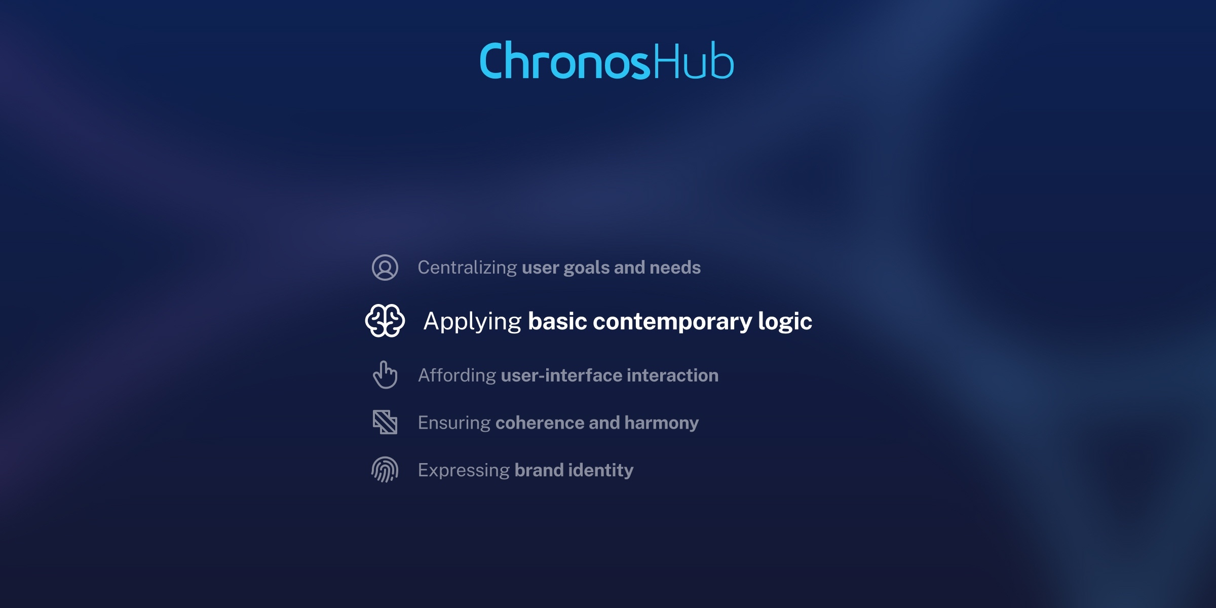
Designing ChronosHub to feel familiar, even for first-time users


Imagine opening a website you’ve never visited before. The login button is placed at the top left of the screen, rather than the top right. Feels off, doesn’t it?
You might need three or four seconds to find the button at all. That’s because this design choice, which might seem arbitrary at first, actually violates our deeply ingrained expectations of how websites look and behave.
These expectations are part of what psychologists and designers call mental models; beliefs we build based on past experiences. When a design aligns with our mental model, it feels intuitive. When it doesn’t, we stumble.
This phenomenon is crystalized in Jakob’s Law of UX. Coined by Jakob Nielsen in 2000, it states: “Users spend most of their time on other sites. This means that users prefer your site to work the same way as all the other sites they already know.”
Nielsen was a pioneer of usability back in the web’s early days. This was a time when function often trumped user experience; a 1998 New York Times piece labeled his field “esoteric”. But today, that’s very much turned around, with Jakob’s Law inspiring countless design conventions that help us navigate systems (websites, software, platforms) with ease and efficiency.
Old habits die hard
Designing for familiarity may have become a widely adopted approach, but some sectors are still playing catchup. Scholarly publishing is unfortunately one. Anyone who’s submitted, reviewed, or managed a manuscript on its way toward publication can attest to this. Clunky interfaces and opaque workflows that seem leftover from Netscape’s heyday.
What’s behind this stasis? Well, if tech is “good enough” it tends to stick around, because publishers and institutions face significant budgetary and change management concerns in changing it. While the end-users most affected—authors, reviewers, and editors—don’t hold the purse strings.
But this can’t continue. There are more digital natives in the research fields than ever. They take intuitive experiences as a given, whether it’s social media or their banking app. Jarring experiences that used to be tolerated now feel like barriers. And organizations that can remove these barriers differentiate themselves from the competition.
Our approach at ChronosHub: Ordinary Contemporary Logic
ChronosHub was proudly founded by scholarly publishing outsiders. Despite the many industry experts who’ve joined us since, we’ve kept this outsider mindset alive and kicking. It leads us to take new approaches in a space that can be slow to evolve. So, from the beginning, we were determined to put user experience at the heart of our platform.
Our incredible product designers Yen and Marjorie help us do this in a strategic way. They’ve instigated five design principles. One of them is called Ordinary Contemporary Logic, which shares a lot of DNA with Jakob’s Law.
“Ordinary” because our designs should feel similar to people’s common everyday interactions with other systems. And “Contemporary” as our work keeps pace with whatever tech advancements become the standard.
What about the other four design principles you say? Yen and Marjorie talk through them all in this webinar, together with some special guests.
Example 1: Publishing order summary
We all do a lot of shopping online. And whether you’re buying new shoes or insurance, the flow is now standardized, in no small part due to the influence of Amazon and Shopify.
Before paying for everything in your cart, you get the chance to review your order. On the order summary page you can expect to see:
- All your item listed. You have the chance to change the amount of each item or remove them altogether.
- A breakdown of costs, together with a grand total.
- A field for adding vouchers or discount codes.
- A clear “checkout” button that will take you into the payment flow.
These elements are usually arranged in the same way: Your items on the left and the other details to the right. It’s a clear, comforting interface. One that easily lets you confirm that everything is correct before you fork over our hard-earned cash.
We took inspiration from this page to simplify the complex world of post-acceptance. This is where authors need to choose their license type and pay any publication costs, such as APCs.
On our publishing order page, authors can choose between the different publishing routes available to them. For each one they choose (“Open access – CC BY 4.0 license” for example), they can see in real-time how this affects their total payment due. On the right, their “order summary” includes details on the journal, the author’s affiliated organizations, and their agreement eligibility.
All housed in crisp, calming white boxes that present this important information with zero fuss.
Example 2: Publications page
Browsing different journals has long been a pain for authors. There are plenty of journal indexes out there, but they tend to display journals in list form, with limited functions for filtering and sorting. Key information, such as Impact Factor and publishing model, can only be found by clicking through to a further page.
For authors wanting to compare journals in their field, it’s a positively unfriendly user experience. In redesigning it, we looked to ecommerce again for inspiration. Specifically, the mighty product listing page (PLP).
A crucial stage of the online customer journey, a PLP displays multiple products based on a category or search query. According to UX experts NN/g, “users expect product listings to provide enough differentiating information so they can fully understand whether an item is worth a click.”
To see this in action, imagine browsing an online bookstore. You click “Bestsellers” in the top navigation. You’ll see all the books in this category laid out in a grid form. Each listing features a high-quality image of the book cover, the title, whether it’s hardback or paperback, a customer star rating, and most importantly, the price.
In transposing this to scholarly research, we kept the instantly recognizable grid layout. And we worked together with our customers to decide on what essential information each listing needs. This includes:
- Journal title
- Journal cover image
- Publishing model (open-access, hybrid, etc.)
- Name of the Editor-in-Chief
- Impact Factor
- “Submit” button
In addition, users can filter the listings by many of these elements.
Over and above the information included on the listing, it’s important to emphasize the aesthetics. Including cover images on this page may seem unnecessary. But we’re visual creatures. And we’re submersed in visual stimuli across the rest of the web. So, designing an interface that’s more colorful and stimulating helps, not hinders, journal discovery.
Feels like home
Scholarly publishing has dramatically reshaped itself over the past 20 years; moving from print to digital and embracing open access. These transformations promised accessibility and innovation. Unfortunately, they’ve being stifled by tech that delivers the exact opposite.
At ChronosHub, we want to meet our users where they already are, in digital spaces that are fast, intuitive, and shaped by clear design conventions. We shouldn’t force them to “learn” how each new system works. That should be second nature, so they can devote their time and energy to the research which moves us (and the world) forward.
Share this post


